fredag 7 oktober 2016

ROTTING IN BLOOD

I think it was said in an interview that the artwork for Swedish Coldworker's second release "Rotting Paradise" was inspired by the, much deserved, cult album "Reign in Blood" by Slayer.


Both albums are great and highly recommended.. in your physical collection. Just writing this triggered me to revisit "Rotting Paradise", which I haven't done for ages. One of those albums I know are good, but somehow has fallen into oblivion.

I think it's much more fun to discover for oneself what's been loaned and inspired in this one. Some stuff are facts, some we can only just speculate upon. Me pointing it out feels kind of redundant.

The lower right corner with the title in grey above a black and red background reminds me of the sublime artwork for Obliteration's (also sublime) album "Black Death Horizon". I hardly think this was a inspiration, but it's still nice to have a reason to post this cover art as it is majestic and beyond.

torsdag 15 september 2016

THE UNKOWN METAL STRIKE

A quick post today. So I give you something that is fairly obvious, but still fun to put up.
Gotham City vs. Helvetets Port.

Both bands Swedish, both bands heavy metal. Gotham City was formed in 1980 and was hard rockin' with swords and chains till '87. First effort to be released was "Black Writs" in '83, followed by their full length we have here (below), "The Unknown" in '84. Gotham City stayed a pretty obscure band for years, until today, when people hail them as one of Sweden's finest.

Helvetets Port is a band from Gothenburg (at least nowadays) who have followed Gotham City's footsteps since day one, and have done so well. Formed in 2001, a demo was first made in 2004 called "Metal Strike", and then later a single called the same in 2006 which we see below.

As for the artwork. Inspired. You got the sketched warrior (though HP got a one plus, obscure dude hugging his v), red and yellow background, tiny bit similar logo, and title in lower right corner.
So besides using an iron pumped drawn warrior, we get another tribute in the picture as well. Both muscle packs got their warlords initials on their bucket belts. GC to the left, HP to the right.
I mentioned that the logo's are similar. Yes, I think so, but not stolen at all. No letter is the same, but the feel is! The only thing borrowed, if, is the cross we see in Gotham's G and Port's T. But even those crosses aren't really the same. And then the background. Same color, not the same drape. Gotham City have a cross fade of colors coming downwards, whilst Helvetets Port have a two pallet thingy crossing the cover... and their logo is green.........


As you can see, this is a cover well done. Nothing to bitch about at all. I salute the idea! To wrap things up; listen to both bands. The music is as good as these two album covers!

fredag 2 september 2016

WARLOCK PENTAGRAM

Not really the same. But I can't help think Warlock Moon thought a little of the classic Pentagram cover when finalizing this release. Definitely inspired.

måndag 29 augusti 2016

ADAM AND THE HEAVY METAL GAMBLER

Yes, we all know Michelangelo would have been into heavy metal if he lived today. All great minds would. So this adaptation of his great art piece from 1512 is by no means blasphemy. Buzzard was a Belgian Speed Metal outfit who released "Gambler" in 1984. When it came to artistic greatness they were spot-on on several levels. In my dreams I wish there was a full size adaptation of this cover art! Adam finger cuddling with a studded stud.


I guess it would have looked something like this:


THE ROMANTICS X2

Sometimes when it's time to release yet another mind-blowing single, the art department choose to just flip the previous cover. Why? Because it's not confusing for the customers! It's settling.

fredag 29 juli 2016

THE SAD WINGS

We are all familiar with Judas Priest, but we aren't all familiar with the Mexican band Abril (April). Apparently they begun their journey through rock history in 1984 and released their self-titled debut record in '88, four years after formation. Abril played very synthesizer driven hard rock with a few cool tunes I quite dig! But they also managed to play a few horrid notes as well, at least on the album in focus today: "Testamento", their second record, which took another six years to perfect.

So in 1994 Abril asked a person to do a nice cover for them, and so that person did! The cover for "Testamento" is great! Winged death holds a naked child, who just wants to rock with his guitar, in his hand, probably offering him the journey of his life.. Or more sadly; of his death.


But as you can see, I'm guessing the cover artist wasn't that confident about painting wings, so he thought it would save him some trouble borrowing the shape from Judas Priest's record "Sad Wings of Destiny" from 1976. No shame in that. It's not a total rip, I mean mostly just the shape right? Who ever did the cover did it good and should be proud. Actually the whole sleeve is great but unfortunately I couldn't find any version who could do it justice quality-wise on internet, but this will do:


You get the picture!

JACULA

Ever heard of a band named Jacula? Now days a lot of underground folks have, but did you know that a Italian erotic horror magazine also did exist with that same name, and that the (also) Italian prog-group borrowed their logo from that magazine!? You might as it is pretty easy to google. But now its official.

onsdag 27 juli 2016

POWER FROM CHOCK

Let's head back to the comics department! Have you ever heard of a band called Onslaught and their cult record "Power from Hell"!? Yes you have! Or damn should!!

Apart from being an early thrash/death effort in the same vain as many other angry teens at the same time, Onslaught did something in the year of '85 only one other band did that year. They named a song "Death Metal". Who was the other band? Possessed of course! Funny thing though. Possessed has been, by many people, referred to as the first Death Metal band mostly for one reason only; they did a song called "Death Metal". Like with Venom's '82 gem "Black Metal". If it says "***** Metal" then it is "***** Metal"! Right? But the thing is "Seven Churches" was released in October '85 whilst "Power from Hell" was released in February '85 with a back cover that did not only have the mentioned song in the track list but also stated in big letters "Death Metal" and also sorted up the A side and B side by calling them "Death Side" and "Metal Side". What? So wait! Was Onslaught the first Death Metal band? No, probably not, but I wanted to state the obvious and now we are side-tracked because this is an completely different topic which will in the end as always be somewhat pointless.

And for the sake of it we should also name drop Vulcano and remember that they did a track called "Death Metal" too, but in '86, one year before their country men in Cova did the same on a demo. 

The album art for "Power from Hell" is one of those I would think to be original, but really shouldn't because they seldomly are.


As you can see it has some finesse to it. The axe carrying demon of the original has on Onslaughts cover a cozy little cloud of smoke emerging from the pentagram below. My example to the far right is from a Swedish horror magazine which published foreign comics. The one in the middle is the original which was probably featured in one of the comics which CHOCK re-published for us in the country of Bathory cavaliers.

...should also be mentioned that Suffocation used the whole image in 1990 for their first demotape.


tisdag 26 juli 2016

UNFINISHED BLACK METAL

...to start off with the most obvious:

Exit 13 released in '95 a EP called "...Just a Few More Hits". As cover art they choose to redesign Venom's iconic album "Black Metal". Instead of a pentagram we get a (sweet) leaf and the goat enjoys a little dobbido whilst his eyes gets a little saggy. It's not brilliant but it's well done!! Of course they also exchanged the symbols on the horns. 666 became 13 and the turned cross a bong?

Now, the funny one is of course pictured first. Barrow Wight is a Heavy/Black Metal band according to metal-archives, but a heavy rock band according to themselves. Hailing from Canada these guys has their lyrics set on Tolkien and maybe a slice of clichés? Just guessing from titles such as "In League with Sauron" and "No Sleep till Gondor".
Pictured here is the compilation album entitled "Unfinished Tales". And yes, its Venom's goat in a helmet.


Music wise they do sound a lot like Celtic Frost, Venom and Bathory. Their logo is pretty cool but even that one is heavily inspired by Venoms own. But it's subtile enough to not come out as a rip-off.


And their up coming album is apparently going to be called "Kings In Sauron's Service", sounds familiar? But, why not I guess.

I recommend a listen as they are quite good, but I would have preferred a bit more seriousness.

fredag 1 juli 2016

THE VALLEY OF 1989

Ok.. So fuck it.. I wasn't that interested in unraveling all album covers associated with the works of Gustave Doré, as they are legion, and mostly boring as they are just "stolen". But I guess I will write about some, if they do have an interesting story, or historical ba-boom.

Gustave Doré was known for illustrating such adventure novels as Paradise Lost, Rime of the Ancient Mariner, The Divine Comedy and The Bible. The artwork in question today is from that latter book, The Vision of the Valley of Dry Bones:


So by now most of you would recognize this as the cover for Merciless debut record "The Awakening" from '90. Some of you might even know where we are going next with this post.


So to the left we have Merciless, to the right we have Sacred Crucifix demo from '89, the year "The Awakening" was recorded but yet not released. On the demo we see the watching man on the hill, which is obscured on "The Awakening" due to crop issues. But what I think is so fantastic about these two covers beyond the usage of the same picture is the name on Sacred Crucifix's demo: Realms of Darkness. Sounds familiar? It should as Merciless demo from '89 was entitled "Realm of the Dark". I mean, isn't that two great coincidences?

So, pushing forward. We have these beauties as well:


First the reissue of "The Awakening" on which they had the brilliant idea to mirror the cover and put some color on it. I mean, that's makes it a totally different cover right? I guess they knew about these other releases and wanted their album to stand out on this second coming.

The second is Monastery's EP from '92 "The Process: Church of the Final Judgement" which isn't just a cool title they made up, but actually was a cult worshiping both Jesus and Satan under the sign of a Swastika like symbol. What's funny about this one is that the Bassist and one of two Vocalists was Lars Rosenberg, mostly known for Carbonized and his time in Entombed (Crawl, Clandestine, Hollowman & Wolverine Blues) - pictured below:


Monastery was a band from the Netherlands with two members from Sinister plus Lars, the Swede. I think it's fair to assume that Lars knew who Merciless was and had heard or possible even owned their first album, so the question here is; why did they use the same album cover with Monastery?

Third we have Cat Rapes Dog, which is a brilliant band name and a Swedish Electropunk band. Pictured above is their first EP (not first release thou) from '89!!! Freaky.

Ah.. And I almost forgot that this atrocity also exists:


Jacob's Dream an american heavy metal band which released this album in 2000 through Metal Blade Records on CD, cover pictured to the left. Later on it got a vinyl treatment through No Remorse Record with an updated and possibly even uglier version of the cover art.

Strange how such respected labels do agree to this stupidity. At least they haven't copied the original right off but cut out just a part and added some other stolen (?) art... I guess..

lördag 11 juni 2016

BEING FRANK AGAIN IN BRAZIL

Since we already was on the Frank Frazetta track a week back, I thought we could keep on heading down the same track.

There is no shame in borrowing for inspiration and that's the case here (as I repeatedly state).

When Brazilian Genocídio finally was ready to launch their debut M-LP in '88 they did so on a obscure label called "Ultra Violence" with a rooster gaping empty with only that release. This could actually be a self-release, no Sherlock skills needed to draw that conclusion.

They delivered four tracks of Sarcófago stinking black metal, executed with slightly untuned guitars. A win-win modernly speaking. Funny though is that the drums are pretty tight.

So... For their album art they choice an artist who knew how to use all the colors of the rainbow, but not quite how to paint a cool cloaked shadow.


I think the artwork is super nice! I like color-explosions, and morbid stuff quite childishly drawn. It doesn't really say "I contain extreme black metal" but it does say "I'm interesting and probably good, so buy me". The cover is not a total rip-off as the artist has done his best trying to draw from the original but ended up a bit below the life-full original. It's a bit stiff and it seems he also had the good taste to add a scorpion-tail to the mix.

I wonder if "Death" and his throne is also borrowed? That I do not know...

onsdag 1 juni 2016

FRANK TO FRANK BEING FRANK

So I thought we could pick up things where we left. As I said, Frank Frazetta has been used many times by many medias, and to be frank, it's not that interesting to blabber about when his art has been used just as it is. What's interesting, as allways, is when someone has borrowed. And that's the case with Frank Marino's "Juggernaut" from 1982, an album I definitely recommend if you're into blues oriented heavy/rock.

So, it's not a loan. Much have been changed. I guess the artist used Frank Frazetta's original piece as base ground and just went free spirit on the rest. First off, there's a lot of black added. The lightning aren't exactly the same, slightly different and the shine/impact on the sword is also kind of different. And while we are at the tip of the sword we can see that the man behind "Juggernaut" had the good taste to put a guitar head on top. Classy shit.


What's more changed? The hair right? Originally a brute black/browned haired barbarian as myself has been turned into a blonde guitar player with a soft spot for working out. I also suspect that the sword actually leads some electricity by looking at his hair. That fluff has to be the result of an electric shock!

And thats about covers it. Not much, but enough.


måndag 30 maj 2016

THE MASSES WAR-LAW

Mass was a german heavy metal outfit who managed to record eight albums between an, almost, ten year span running through '77 to '86. They formed in '73 so it took them six years to perfect their craft or just get a record company's attention.

I absolutely dig their seventh album "War-Law" and its cover art, and of course that's what this entry is about. But first of, before we get into the illustration we have to set one thing straight. Why have I written the title as "War-Law" instead of "War Law" as the cover clearly states? Because contrary to what the front cover and various internet pages wants you to believe the actual title for this record is "War-Law" and not "War Law". But how do I know that? Just by looking at the spine and the back of the cover you'll see that they have spelled the title with a "-", so that's two against one! Nice to have that one in the open! Now to something important.


The cover art shows us an guardian angel and a foxy redhead amazon. This actually reminds me of the superior sci-fi adventure of "Barbarella" from '68, when she gets carried into battle by her blind lover.


But Mass cover ain't a sci-fi illustration. It reminds more of an illustration by Frank Frazetta, known for his work on Conan the Barbarian, the cartoon "Fire and Ice", used/featured on tons of rock/metal covers by such bands as Molly Hatchet, Danzig, Dust, Solemnity, Wolfmother, High on Fire and Frank Morino to name a few.. Something we might get back to in the future.

The painting was done by a German called Martin Meyer, who also did three other pieces for Mass. Though it's freaking cool, it has to be said that winged Achilles holding Red Sonya is quite crappy at his job. Sure he guards her from getting her head pierced by spears, but when this photo was taken, he was so busy doing just that so he forgot to hold her in a appropriate way, and what we are witnessing is her looking into the camera, realizing she's about to fall to the ground and die. She's clearly not making a fuzz about it, still swinging her sword, but look at how poorly he holds her! She's doomed.

Red Sonya for you:


torsdag 26 maj 2016

TOUCHED BY SINNERS

Most of the time we assume that bands chosen cover art are original pieces, except maybe when we face an old classic painting, an illustration by Gustave Doré or a photo from World War II. It's also easy to assumed that most stuff from the 80s is original, but of course that's not the case.

There have been cases where scenes from movies have been used as inspiration to artworks, such as Cancer's "To the Gory End" '90 (Which we include to this post, assuming most people know this) who was inspired by the supercool machete cut in "Dawn of the Dead" from 1978.


Also posters or cover artworks from movies have been borrowed, twisted or ripped in order to sell records with a cool front. But what we rarely think of, being not as huge as the music or film industry, is the comic department. Have bands ever borrowed, twisted or ripped anything from comic books? Yes they have! And when you look at Sinner's fourth record "Touch by Sin" from 1985, do you think "Hey, that could easily have been a front cover of a comic mag!"? No, you don't. At least I never did, because it's sleazy perfect for the record (Not calling Sinner Sleaze here thou), but you should, because it is.


I have very little detail about the true origin of this artwork and where it originally comes from. In this picture you see a Swedish magazine which published adult cartoons mostly from French magazines. I tracked down the artist name, which apparently is Gi Versalt? But that's where the hunt ends.. Apparently he hasn't done enough for internet to care. But look close and you'll see that Sinners cover ain't just a total loan, as the art department actually has added some sweet lingerie to the butts legs, and used someone who apparently has no clue how stay-ups work.

To be continued, Mat Sinner wasn't the only youngster to pleasure himself while dreaming of perfectly shaped cartoon women.

For all non-swedish homo-sapiens out there, the blue text states: "Gargle"! Wheelchair Drama

Genius.

onsdag 25 maj 2016

FRAGMENTS OF SOULS IN HELL

Italian Necrodeath's "Fragments of Insanity" is a must have in all deathrash™ (Sarcófago '87) metallers collection... LP, CD, MC, doesn't matter, the music is mind blowing on each and every format. So if you don't have it, get it or get the fuck out (and get it)...

Lets agree that labyrinths are pretty cool stuff. Who doesn't wanna try one out? Of course not if it's a death trap, but for fun I surely would. Today's topic is Necrodeath vs. Evil Madness. As pictured below you can see that the two album covers aren't much alike except for the fact that both portraits a labyrinth. What we have here must be some sort of homage, because it would be strange if the gus behind Evil Madness wasn't aware of Necrodeath's masterpiece from '89 while launching their debut in 2010.


While "Maze of Souls" makes me think of "Fragments of Insanity", the later makes me think of the labyrinth in Hellraiser: Bloodbound from '88


I guess what's similar with these three paintings is that the labyrinths seems endless. Other from that, not much. "Fragments..." has kind of the same angle as "Bloodbound" while "Maze.." is just straight in line. A third album cover that comes to mind is Blue Öyster Cult's debut from '72.


But by that comparison I think we're of track, since that cover art just seems to portrait and ill-planned storage space or an infinity of rooms and doors leading to who knows where...

BUT WAIT! If we put Blue Öyster Cult's album art and Necrodeath's together, we might have find the true origin to the inspiration to "Maze of Souls"? Nope....


tisdag 3 maj 2016

THE FEAR OF THE DARK

Of course we all want absolutely everything that Iron Maiden does to be 100% original, and I would guess most of their stuff are, even though another Iron Maiden did exist in the 60s (without much success, and a 90s release of old tracks) and the fact that most of their lyrics are inspired by poems, novels and history (but to be fair, that goes for a shit loads of bands).

But we do have one album fitting like a glove (of metal) into the concept of Uncoverseum. Namely: Fear of the Dark. This may come as a shock to some readers, so be warned! To others, no biggie. Have you ever scrolled through a case of vinyls you might quite likely have crossed this other piece. Of course we're talking about the album Fear of the Dark... By Gordon Giltrap.


Funny about Gordon Giltrap's album, which was released in 1978, is not just the title as you can see, but that he used the same font that we later in music history only would recognize as the "Iron Maiden"-font, and he did use it on his previous release in '77 as well. It was also used by other bands. An example of that is Hawkwind's album "Choose Your Masques" in '82.

Even though this is fun as hell, I have a hard time imagining that Iron Maiden was inspired by this release. Or was they? Please correct me if I'm wrong. The Gordon Giltrap album does have a quite funny looking cover. What does it mean? Iron Maiden's version is pretty obvious. If there's a monster emerging from a tree you might be afraid of the dark. But what does the other album cover tell us? To use glasses?? Or if you don't wear them, it all goes black? No, just fuzzy, black means blind. Maybe he should have used a blindfold instead of glasses for his cover. My guess is that this is a classic 70s cover where people just stopped communicating with each other, or the artist just didn't give a rats ass what the suits did to sell his record.

What ever happened here, I'm glad it did so that I years later could feel a bit excited when I pulled up Gordon Giltrap's slighly forgotten and ugly piece of work out of the dirt. But even though the cover stinks or just isn't much, theres some gold imprinted on the wax.

torsdag 28 april 2016

THE V'V'V' LOGO'S

That Vektor likes Voivod could hardly be news to anyone and that their logo is inspired by theirs, shouldn't either. But Vektor isn't a rip-off by any standards and those unfamiliar, should pay their thrash a visit. But here we got three logo's and the third (or second in the picture) is Vomit, a Greece black metal band from the 80s who only did two demos. They do not sound like Voivod. What we got here is more of a Sarcófago, Sadistik Exekution, type of thing going on, but their logo sure makes us think about those Canadian geniuses.


It's interesting how these stands out so much and feels to so many like a type of rip-off. I mean, have you ever seen a logo that reminds you of the Nihilist/Entombed logo? Countless black metal logos taking each others hands, thrash and brutal death metal crap merged together by shit and blood?

I enjoy these logo's tons more rather than something that looks like a damn doodle. Why can't we have a wave of artistic mechanical-looking logo's? I wouldn't mind. But of course we then would expect the lyrical themes to follow that.

Interesting to point out in this case, as the title does as well, is that all three bandlogo's begin with a "V"... Just saying...

onsdag 27 april 2016

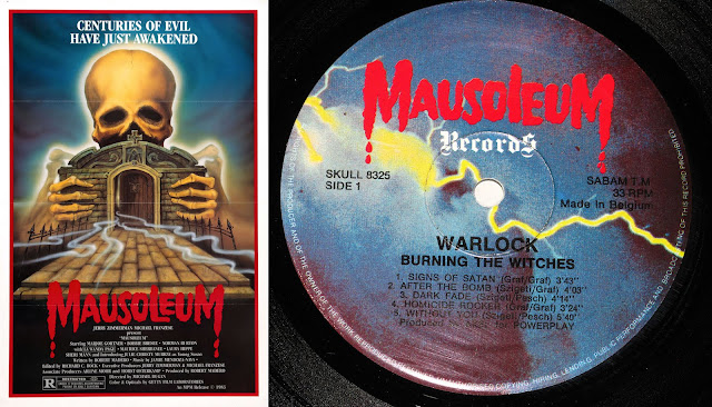
THE MAUSOLEUM CODE

Most underground warriors are familiar with the sublime record label "Mausoleum" and probably some, of the low budget horror flick with the same name as well, but today I'm not counting on that.

This is actually a tricky one in a "who was the chicken and who was the egg"-scenario. But first off, lets take a closer look at the logo's, because as you can see they are not 100% the same, more like 90% maybe. The L on both logo's are different. On the left we got a capitol and on the right we have a minuscule.


This is the case; The movie "Mausoleum" was released in 1983, but according to Metal-archives "Mausoleum Records" released their first LP in 1982 (The same year they state it was founded) and according to Discogs it was released in 1981? We are talking about the re-release of Barón Rojo's great album "Volumen Brutal".

But I believe this to be incorrect and that "Mausoleum Records" actually took their logo from the horror flick. Why? Because their catalog numbers was SKULL 83** or SKULL 83*** (Some starts of with BONE or FIST etc, to add to the confusion) which I think you should read as 83 = founding year, ** = release order. So if that's the case, logic would suggest that Killer's "Ready for Hell" (SKULL 8301) is their first release, followed by Killer's second album "Wall of Sound" (SKULL 8302), both re-releases from 1981 / 1982.

But we also have this little hick-up with the two L's. The whole logo was done with capital letters from the beginning, but due to copyrights reasons (?) "MAUSOlEUM Records" decided to cut of the floor to the L and stretch out the E? It's not that far fetched, right?

One last nail in the coffin though. What's stated as their first release is the english version of "Volumen Brutal" and of course is entitled "Brutal Volume". For this release its catalog number is "SKULL 8327", but "Mausoleum Records" also re-released the album in it's original language with the catalog number "SKULL 8326". So... Is it that ignorant to think that maybe these two releases came out around the same time? And was in fact their 26th and 27th releases?

tisdag 26 april 2016

REALITY, BRUTALITY, DRUGS & MURDER

If you spot these two last artworks on the right, on the net or in a record store, of course you're gonna think of Black Sabbath's classic masterpiece "Master of Reality".

I will not talk that much about these types of cover arts where the original inspiration is 100% obvious, and in these two cases it's of course not at all about being original, but to give Black Sabbath a much deserved homage. But anyway, I think this makes a quite nice post, so...

måndag 25 april 2016

THE DEVIL'S BRIDE

So.. What does happen when the Devil takes a wife? Well, I guess a stoner band use his image as their cover art "20ish" years later?

But don't get me wrong, this is actually well done. In Electric Wizards updated version we get the Devil without his eyes except for just one big one on his tommy, as in the original, but they have also turned the chick completely nude and made her hair a little bit more psychedelic! That's enough originality for me and the final result is haunting, especially with the very classy lettering.

I think that english Electric Wizard has had some great cover concepts, I give them that, but also have to confess that I've never fully understood their music. Probably because I'm not that into Stoner.


"The Devils Bride" was released in 1968 and sometimes goes by the name "The Devil Rides Out" which usually features a different artwork.  Electric Wizard's "Witchcult Today" was released in 2007.

lördag 23 april 2016

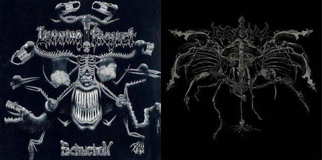
EXTINCTION VS. DEATH'S STRIKING WINGS

I don't know if Erik Danielsson is aware of the existence of the German Death Metal band Lemming Project or not. Either way his artwork for Degial's "Death's Striking Wings" has an uncanny resemblance to their first album "Extinction" from 1991. I'm not saying that it is spot on, but it has the same idea. I would not be surprised if Degial's artwork actually was done from an original idea as our universe works in mysterious ways, and if that's the case: cool.

Either way, out of these two I must say that Erik's creation comes out as the winner. It's a great cover artwork, and Degial's new LP "Savage Mutiny", also featuring artwork by Erik Danielsson is equally as great in it's complex simplicity.

Music-wise I strongly recommend both these bands!


NAKED CHILD VS. LAZ

Do we got any Lee Clayton fans in the house? Of course he's super huge.. Well maybe not to all of us. And the same goes for Halloween, a french, very less known progressive rock group from the 80s/90s.

Todays post is about Lee Clayton's great release "Naked Child" and also Halloween's fantastic album known as "Laz" (even thou the liner notes on my re-CD says "I.az", but then again, the spine says "Laz") and their respective covers.

In the picture below I've put together the two artworks side by side so we easily can make the comparison. Anyone who doesn't see any resemblance and totally disagrees should visit an eye doctor and consider wearing glasses because it's starring you right in the FACE!

Lee Clayton released "Naked Child" in 1979 on Capitol, so it's obvious that the artwork artist responsible for Halloween's "Laz"-cover, released in 1990, owned this magnificent record and looked at it while painting his alien-version.

So let's get started for real. Lee Clayton's "Naked Child" has actually a quite disturbing looking artwork. We have a man, naked or in tights, standing in a doorway with bottle and glass in hand, looking at you. The naked child in his/her bed? Or is he the naked child? Because he's naked and can't handle the reality as a grown up and resort to alcohol consumption?

Halloween's artwork is much like "Naked Child" except mirrored and slightly altered. In "Laz" we see an alien coming out of his spaceship, or the sewer, tightening his fists. I don't know what's more to be said, except: look at it and agree; "yeah, this is no coincidence, but hey, two great covers."


Great tracks to "Youtube":
Halloween - Yule Horror
Lee Clayton - I Ride Alone

TERROR, INCEST AND DEATH!!!

This album cover is so great that it almost implodes! There's a lot going on here. A dead guy risen in a Aggressive Mutilator shirt with his fatal cross behind him, drinking booze, puking while also wearing tight jeans, maggots and a barcode in his forehead.

I love these types of cover artworks where there seems to be a lot of shit going on.. We got a ominous sky, skulls on the ground, a crucified corpse (666), cathedrals and skyscrapers (one with an eye, yeah why not? The electric eye!!), CHAINS!!!, toxic release, fire, graves and probably best: PIGS! We got one pig who is a priest, one who probably is a businessman of some sort, and a WAR PIG, sitting in his tank... I'm quite frankly a bit baffled that we don't get a pig who's a cop here, but maybe they tried to steer away from clichés!? 

Oh, I forgot about the bird. That's mean shit right there. Because I guess it's a vulture... 


Cover artwork by Klaudiusz Witczak. He has done some great covers over the years worth checking out.. Klaudiusz Witczak @ Metal-Archives

And now to something that we will mostly do here on the Uncoverseum. Talk about the inspiration we think people might have had in creation of their own original work. So.. The Aggressive Mutilator logo.. It didn't spring from nothing, and this can hardly be news for underground warriors, but lets include it in this post.. Courtesy of brazils mega great Mutilator:


The most striking resemblance lies of course in the "M" "TT"s and "R".

That's it for now. Terror, Incest and Death Out!