torsdag 28 april 2016

THE V'V'V' LOGO'S

That Vektor likes Voivod could hardly be news to anyone and that their logo is inspired by theirs, shouldn't either. But Vektor isn't a rip-off by any standards and those unfamiliar, should pay their thrash a visit. But here we got three logo's and the third (or second in the picture) is Vomit, a Greece black metal band from the 80s who only did two demos. They do not sound like Voivod. What we got here is more of a Sarcófago, Sadistik Exekution, type of thing going on, but their logo sure makes us think about those Canadian geniuses.


It's interesting how these stands out so much and feels to so many like a type of rip-off. I mean, have you ever seen a logo that reminds you of the Nihilist/Entombed logo? Countless black metal logos taking each others hands, thrash and brutal death metal crap merged together by shit and blood?

I enjoy these logo's tons more rather than something that looks like a damn doodle. Why can't we have a wave of artistic mechanical-looking logo's? I wouldn't mind. But of course we then would expect the lyrical themes to follow that.

Interesting to point out in this case, as the title does as well, is that all three bandlogo's begin with a "V"... Just saying...

onsdag 27 april 2016

THE MAUSOLEUM CODE

Most underground warriors are familiar with the sublime record label "Mausoleum" and probably some, of the low budget horror flick with the same name as well, but today I'm not counting on that.

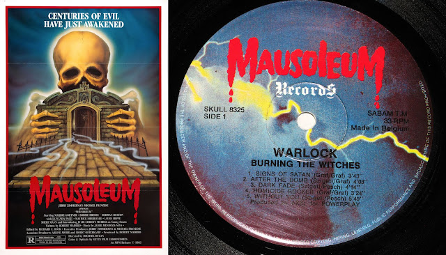
This is actually a tricky one in a "who was the chicken and who was the egg"-scenario. But first off, lets take a closer look at the logo's, because as you can see they are not 100% the same, more like 90% maybe. The L on both logo's are different. On the left we got a capitol and on the right we have a minuscule.


This is the case; The movie "Mausoleum" was released in 1983, but according to Metal-archives "Mausoleum Records" released their first LP in 1982 (The same year they state it was founded) and according to Discogs it was released in 1981? We are talking about the re-release of Barón Rojo's great album "Volumen Brutal".

But I believe this to be incorrect and that "Mausoleum Records" actually took their logo from the horror flick. Why? Because their catalog numbers was SKULL 83** or SKULL 83*** (Some starts of with BONE or FIST etc, to add to the confusion) which I think you should read as 83 = founding year, ** = release order. So if that's the case, logic would suggest that Killer's "Ready for Hell" (SKULL 8301) is their first release, followed by Killer's second album "Wall of Sound" (SKULL 8302), both re-releases from 1981 / 1982.

But we also have this little hick-up with the two L's. The whole logo was done with capital letters from the beginning, but due to copyrights reasons (?) "MAUSOlEUM Records" decided to cut of the floor to the L and stretch out the E? It's not that far fetched, right?

One last nail in the coffin though. What's stated as their first release is the english version of "Volumen Brutal" and of course is entitled "Brutal Volume". For this release its catalog number is "SKULL 8327", but "Mausoleum Records" also re-released the album in it's original language with the catalog number "SKULL 8326". So... Is it that ignorant to think that maybe these two releases came out around the same time? And was in fact their 26th and 27th releases?

tisdag 26 april 2016

REALITY, BRUTALITY, DRUGS & MURDER

If you spot these two last artworks on the right, on the net or in a record store, of course you're gonna think of Black Sabbath's classic masterpiece "Master of Reality".

I will not talk that much about these types of cover arts where the original inspiration is 100% obvious, and in these two cases it's of course not at all about being original, but to give Black Sabbath a much deserved homage. But anyway, I think this makes a quite nice post, so...

måndag 25 april 2016

THE DEVIL'S BRIDE

So.. What does happen when the Devil takes a wife? Well, I guess a stoner band use his image as their cover art "20ish" years later?

But don't get me wrong, this is actually well done. In Electric Wizards updated version we get the Devil without his eyes except for just one big one on his tommy, as in the original, but they have also turned the chick completely nude and made her hair a little bit more psychedelic! That's enough originality for me and the final result is haunting, especially with the very classy lettering.

I think that english Electric Wizard has had some great cover concepts, I give them that, but also have to confess that I've never fully understood their music. Probably because I'm not that into Stoner.


"The Devils Bride" was released in 1968 and sometimes goes by the name "The Devil Rides Out" which usually features a different artwork.  Electric Wizard's "Witchcult Today" was released in 2007.

lördag 23 april 2016

EXTINCTION VS. DEATH'S STRIKING WINGS

I don't know if Erik Danielsson is aware of the existence of the German Death Metal band Lemming Project or not. Either way his artwork for Degial's "Death's Striking Wings" has an uncanny resemblance to their first album "Extinction" from 1991. I'm not saying that it is spot on, but it has the same idea. I would not be surprised if Degial's artwork actually was done from an original idea as our universe works in mysterious ways, and if that's the case: cool.

Either way, out of these two I must say that Erik's creation comes out as the winner. It's a great cover artwork, and Degial's new LP "Savage Mutiny", also featuring artwork by Erik Danielsson is equally as great in it's complex simplicity.

Music-wise I strongly recommend both these bands!


NAKED CHILD VS. LAZ

Do we got any Lee Clayton fans in the house? Of course he's super huge.. Well maybe not to all of us. And the same goes for Halloween, a french, very less known progressive rock group from the 80s/90s.

Todays post is about Lee Clayton's great release "Naked Child" and also Halloween's fantastic album known as "Laz" (even thou the liner notes on my re-CD says "I.az", but then again, the spine says "Laz") and their respective covers.

In the picture below I've put together the two artworks side by side so we easily can make the comparison. Anyone who doesn't see any resemblance and totally disagrees should visit an eye doctor and consider wearing glasses because it's starring you right in the FACE!

Lee Clayton released "Naked Child" in 1979 on Capitol, so it's obvious that the artwork artist responsible for Halloween's "Laz"-cover, released in 1990, owned this magnificent record and looked at it while painting his alien-version.

So let's get started for real. Lee Clayton's "Naked Child" has actually a quite disturbing looking artwork. We have a man, naked or in tights, standing in a doorway with bottle and glass in hand, looking at you. The naked child in his/her bed? Or is he the naked child? Because he's naked and can't handle the reality as a grown up and resort to alcohol consumption?

Halloween's artwork is much like "Naked Child" except mirrored and slightly altered. In "Laz" we see an alien coming out of his spaceship, or the sewer, tightening his fists. I don't know what's more to be said, except: look at it and agree; "yeah, this is no coincidence, but hey, two great covers."


Great tracks to "Youtube":
Halloween - Yule Horror
Lee Clayton - I Ride Alone

TERROR, INCEST AND DEATH!!!

This album cover is so great that it almost implodes! There's a lot going on here. A dead guy risen in a Aggressive Mutilator shirt with his fatal cross behind him, drinking booze, puking while also wearing tight jeans, maggots and a barcode in his forehead.

I love these types of cover artworks where there seems to be a lot of shit going on.. We got a ominous sky, skulls on the ground, a crucified corpse (666), cathedrals and skyscrapers (one with an eye, yeah why not? The electric eye!!), CHAINS!!!, toxic release, fire, graves and probably best: PIGS! We got one pig who is a priest, one who probably is a businessman of some sort, and a WAR PIG, sitting in his tank... I'm quite frankly a bit baffled that we don't get a pig who's a cop here, but maybe they tried to steer away from clichés!? 

Oh, I forgot about the bird. That's mean shit right there. Because I guess it's a vulture... 


Cover artwork by Klaudiusz Witczak. He has done some great covers over the years worth checking out.. Klaudiusz Witczak @ Metal-Archives

And now to something that we will mostly do here on the Uncoverseum. Talk about the inspiration we think people might have had in creation of their own original work. So.. The Aggressive Mutilator logo.. It didn't spring from nothing, and this can hardly be news for underground warriors, but lets include it in this post.. Courtesy of brazils mega great Mutilator:


The most striking resemblance lies of course in the "M" "TT"s and "R".

That's it for now. Terror, Incest and Death Out!